Introduction
The influ2 package is based on the original
influ package which was developed to generate influence
statistics and associated plots. The influ package has
functions that use outputs from the glm function. The
influ2 package was developed to use outputs from
brms and relies heavily on the R packages in the
tidyverse suite of packages. This vignette showcases the
influ2 package.
Functions for exploring data
In this vignette I use a simulated catch per unit effort (CPUE) data
set to model the number of lobsters caught per pot. This data set has a
response variable labelled lobsters and includes the
dependent variables year (from 2000 to 2017),
month, depth (in meters), and
soak (the soak time of each pot in hours). No step-wise
variable selection or model selection is done in this vignette.
The main function for exploring data in influ2 is
plot_bubble which presents the number of records by two
user defined groups within a data set. The bubble size in
plot_bubble represents the number of records across the
entire data set, and bubbles can either be a single colour or coloured
by a third variable in the data set.
library(knitr)
library(tidyverse)
library(reshape2)
library(brms)
library(influ2)
library(bayesplot)

theme_set(theme_bw())

options(mc.cores = 2)
The simulated data set
data(lobsters_per_pot)
nrow(lobsters_per_pot)
#> [1] 15642
head(lobsters_per_pot)
#> # A tibble: 6 × 5
#>   lobsters year  month depth  soak
#>      <dbl> <fct> <fct> <dbl> <dbl>
#> 1        0 2000  01     21.7  27.6
#> 2        0 2000  01     17.2  48.0
#> 3        2 2000  01     10.8  34.6
#> 4        0 2000  01     19.5  48.5
#> 5        2 2000  01     11.0  24.5
#> 6        1 2000  01     38.7  24.5
plot_bubble(df = lobsters_per_pot, group = c("year", "month")) +
  labs(x = "Month", y = "Year")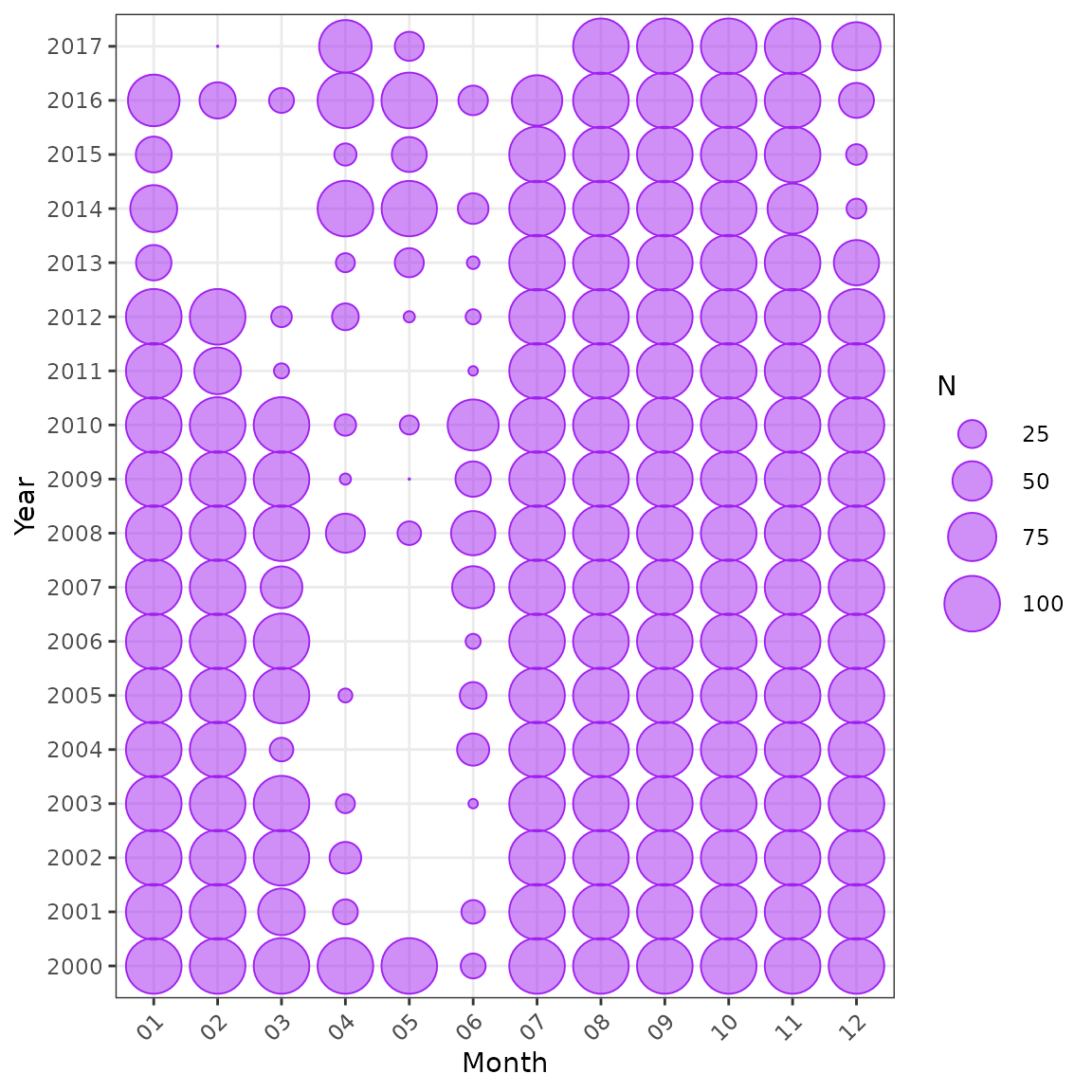
Distribution of data by year and month.
plot_bubble(df = lobsters_per_pot, group = c("year", "month"), fill = "month") +
  labs(x = "Month", y = "Year") +
  theme(legend.position = "none")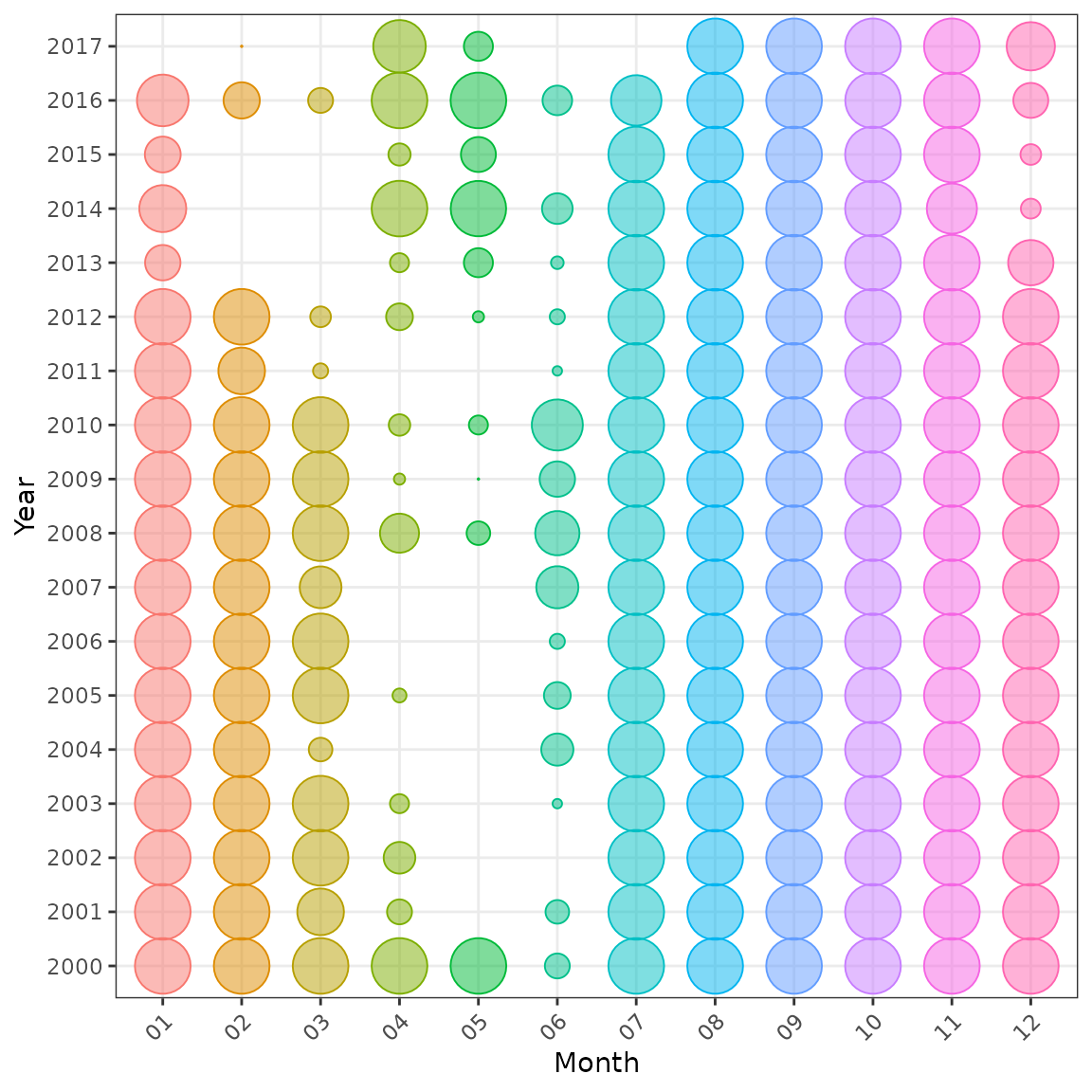
Distribution of data by year and month, also coloured by month.
The origninal influ versus influ2
Two different models are fitted in brms. The first model
assumes a Poisson distributioin and includes the explanatory variables
year, month, and a 3rd order polynomial for
soak time. The second model assumes a negative binomial
distribution and includes the explanatory variables year,
month as a random effect, and a spline for
depth with 3 degrees of freedom.
fit1 <- brm(lobsters ~ year + month + poly(soak, 3),
            data = lobsters_per_pot, family = poisson,
            chains = 2, iter = 1500, refresh = 0, seed = 42,
            file = "fit1", file_refit = "never")
fit2 <- brm(lobsters ~ year + (1 | month) + s(depth, k = 3),
            data = lobsters_per_pot, family = negbinomial(),
            control = list(adapt_delta = 0.99),
            chains = 2, iter = 3000, refresh = 0, seed = 1,
            file = "fit2", file_refit = "never")
criterion <- c("loo", "waic", "bayes_R2")
fit1 <- add_criterion(fit1, criterion = criterion, file = "fit1")
fit2 <- add_criterion(fit2, criterion = criterion, file = "fit2")
Fit a model using glm and generate influence statistics using the
original influ package
myInfl <- Influence$new(model = fit_glm)
myInfl$init()
myInfl$calc()
myInfl$cdiPlot(term = "month")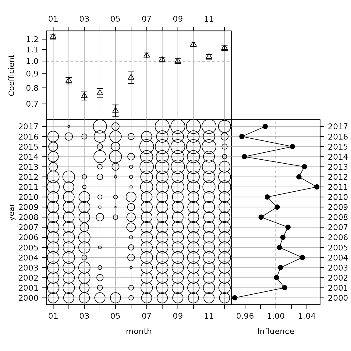
The original CDI plot from the influ package.
cdi_month <- plot_bayesian_cdi(fit = fit1, xfocus = "month", yfocus = "year",
                               xlab = "Month", ylab = "Year")
cdi_month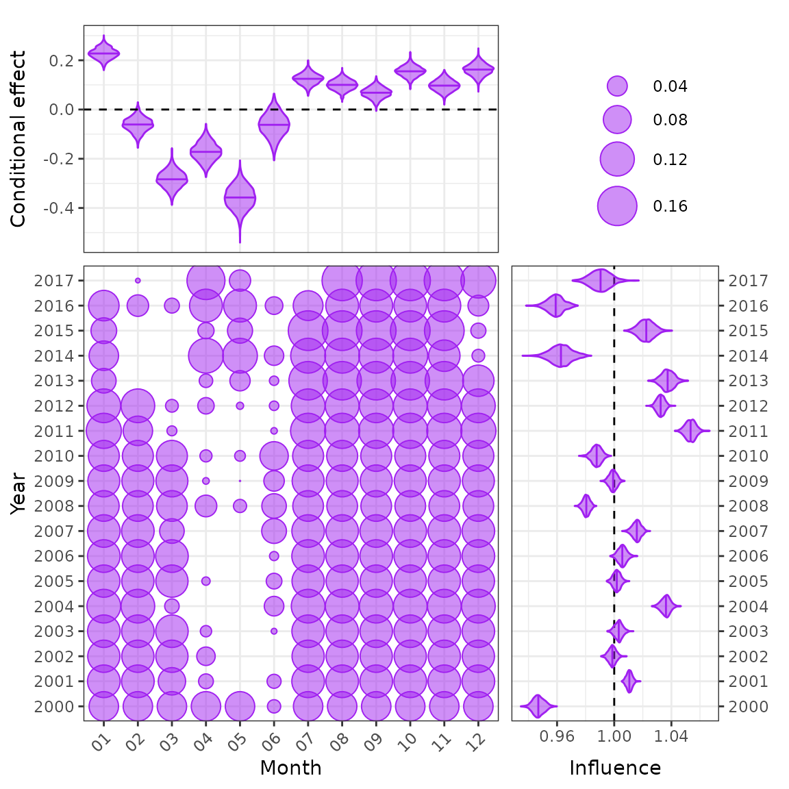
The new Bayesian CDI plot from the influ2 package.
myInfl$stepPlot()
The original step-plot from the influ package.
The influ2 package cannot generate steps plots
automatically like influ. Each step must be modelled
separately and then a list of models defined as below.
The new Bayesian step-plot from the influ2 package. Note that the new step-plot requires that all models/steps be run in brms before the function can be used.
plot_index(fit2, year = "year")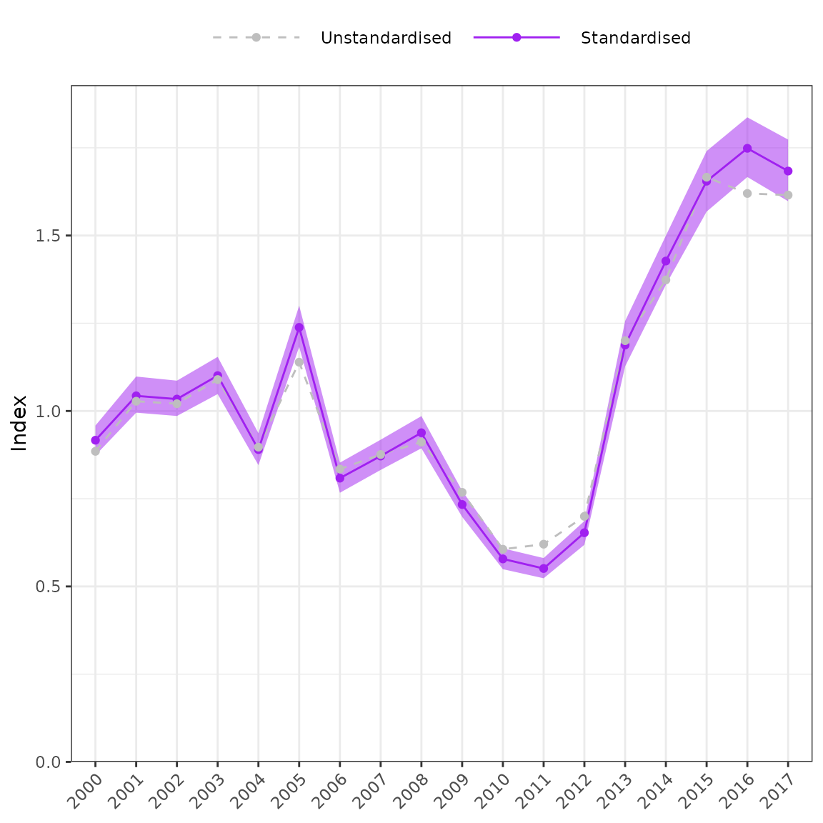
myInfl$stanPlot()
plot_influ(fit = fit1, year = "year")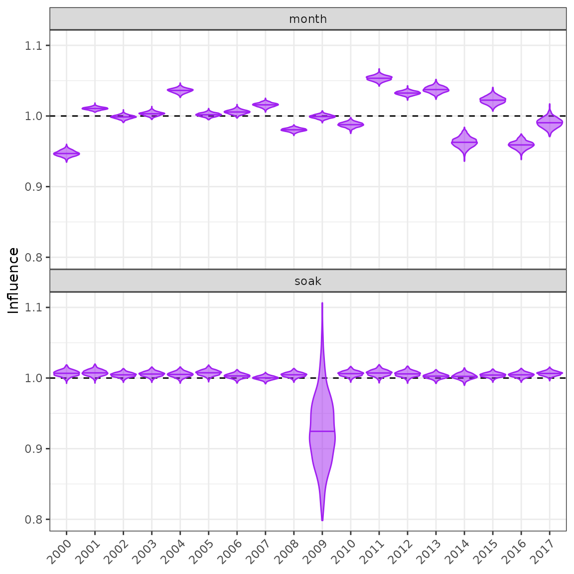
myInfl$influPlot()
i1 <- myInfl$influences %>%
  pivot_longer(cols = -level, names_to = "variable") %>%
  rename(year = level)
i_month <- get_influ(fit = fit1, group = c("year", "month")) %>%
  group_by(year) %>%
  summarise(value = mean(delta)) %>%
  mutate(variable = "month")
i_soak <- get_influ(fit = fit1, group = c("year", "soak")) %>%
  group_by(year) %>%
  summarise(value = mean(delta)) %>%
  mutate(variable = "poly(soak, 3)")
i2 <- rbind(i_month, i_soak)

ggplot(data = i2, aes(x = year, y = exp(value))) +
  geom_point(data = i1) +
  geom_line(aes(colour = variable, group = variable)) +
  facet_wrap(variable ~ ., ncol = 1) +
  labs(x = "Year", y = "Influence") +
  theme(legend.position = "none")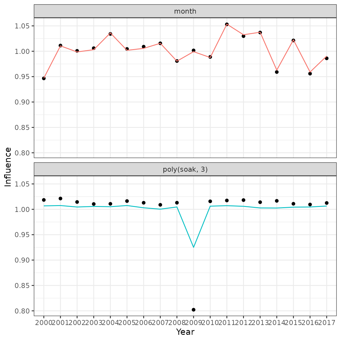
Comparison of influences produced by the original influ package (points) and the new influ2 calculation (lines).
Functions for exploring models
Here I evaluate model fit using loo and waic. Other options include kfold, loo_subsample, bayes_R2, loo_R2, and marglik.
fit1$criteria$loo
#>
#> Computed from 1500 by 15642 log-likelihood matrix
#>
#>          Estimate    SE
#> elpd_loo -25412.3 198.5
#> p_loo        67.9   1.9
#> looic     50824.7 397.0
#> ------
#> Monte Carlo SE of elpd_loo is 0.2.
#>
#> All Pareto k estimates are good (k < 0.5).
#> See help('pareto-k-diagnostic') for details.
fit1$criteria$waic
#>
#> Computed from 1500 by 15642 log-likelihood matrix
#>
#>           Estimate    SE
#> elpd_waic -25412.2 198.5
#> p_waic        67.7   1.9
#> waic       50824.4 397.0
#>
#> 2 (0.0%) p_waic estimates greater than 0.4. We recommend trying loo instead.
loo_compare(fit1, fit2, criterion = "loo") %>% kable(digits = 1)| elpd_diff | se_diff | elpd_loo | se_elpd_loo | p_loo | se_p_loo | looic | se_looic | |
|---|---|---|---|---|---|---|---|---|
| fit2 | 0.0 | 0.0 | -23374.1 | 124.2 | 33.5 | 1.0 | 46748.3 | 248.3 |
| fit1 | -2038.2 | 104.9 | -25412.3 | 198.5 | 67.9 | 1.9 | 50824.7 | 397.0 |
loo_compare(fit1, fit2, criterion = "waic") %>% kable(digits = 1)| elpd_diff | se_diff | elpd_waic | se_elpd_waic | p_waic | se_p_waic | waic | se_waic | |
|---|---|---|---|---|---|---|---|---|
| fit2 | 0.0 | 0.0 | -23374.1 | 124.2 | 33.5 | 1.0 | 46748.2 | 248.3 |
| fit1 | -2038.1 | 104.9 | -25412.2 | 198.5 | 67.7 | 1.9 | 50824.4 | 397.0 |
Bayesian R2 bayes_R2 for the three model runs
# get_bayes_R2(fits)
# cdi_month
plot_bayesian_cdi(fit = fit2, xfocus = "month", yfocus = "year",
                  xlab = "Month", ylab = "Year")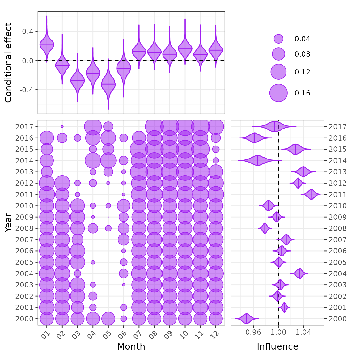
CDI plot for a random effect.
# plot_bayesian_cdi(fit = fit1, xfocus = "soak", yfocus = "year",
#                   xlab = "Soak time (hours)", ylab = "Year")
# plot_bayesian_cdi(fit = fit2, xfocus = "depth", yfocus = "year",
#                   xlab = "Depth (m)", ylab = "Year")
fits <- list(fit1, fit2)
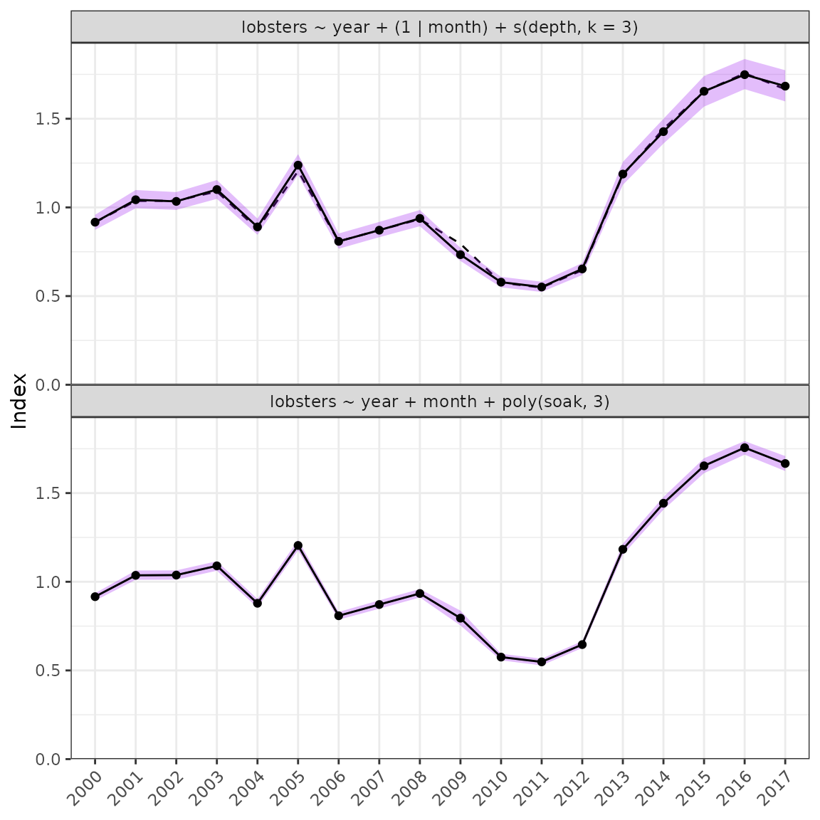
plot_compare(fits = fits, year = "year")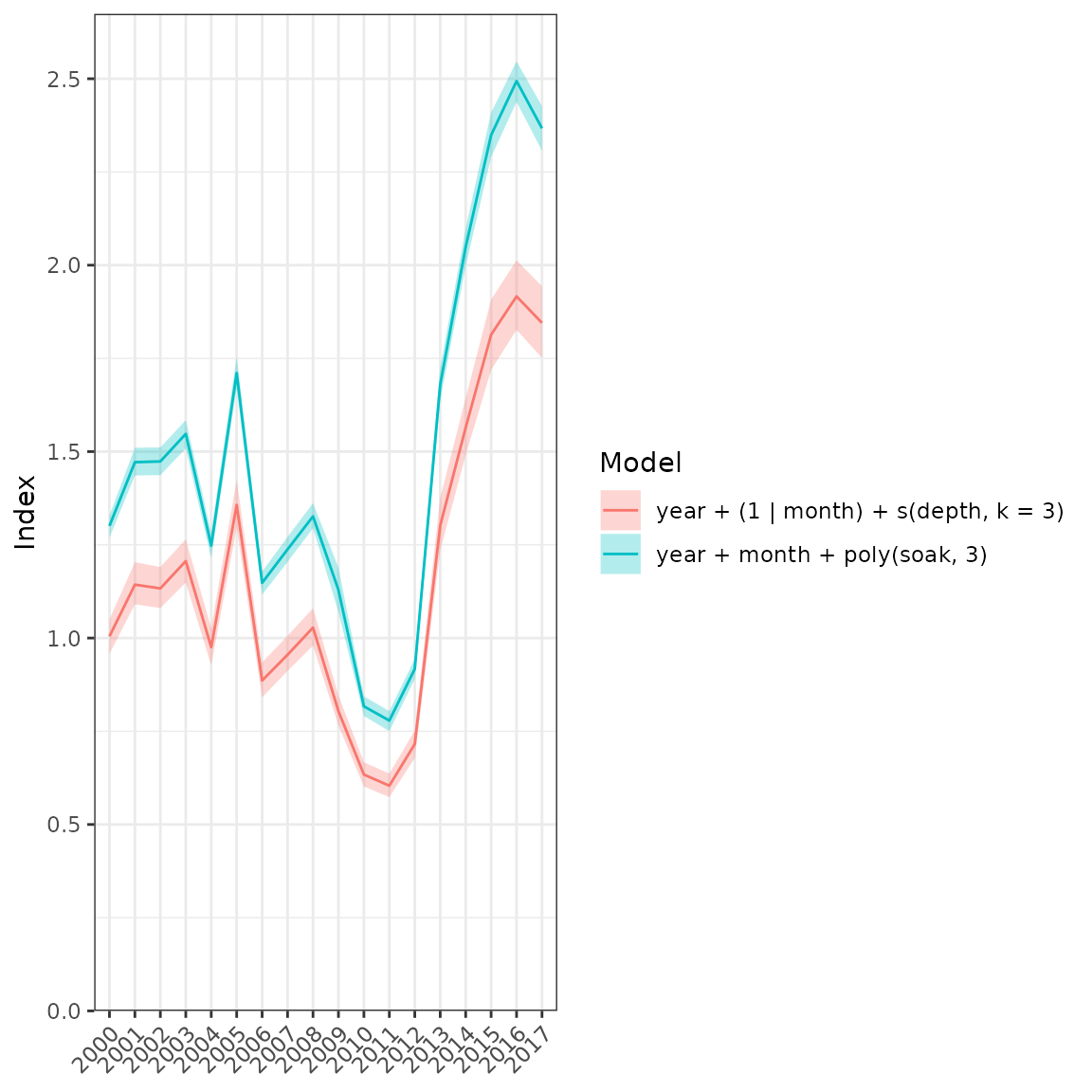
Comparison plot of all model runs.
plot_index(fit = fit1, year = "year")
#> Warning: Removed 18 rows containing missing values (`geom_line()`).
#> Warning: Removed 18 rows containing missing values (`geom_point()`).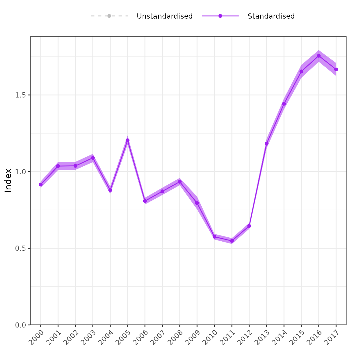
Unstandardised versus standardised series.
Diagnostics
The influ2 package is based on the original
influ package which was developed to generate influence
plots. The influ package has functions that use outputs
from the glm function. The influ2 package was
developed to use outputs from brms and relies heavily on
the R packages ggplot2 and dplyr. This
vignette showcases the influ2 package with a focus on model
diagnostics including posterior predictive distributions, residuals, and
quantile-quantile plots.
yrep <- posterior_predict(fit1, ndraws = 100)
# ppc_dens_overlay(y = lobsters_per_pot$lobsters, yrep = yrep) +
#   labs(x = "CPUE", y = "Density")

ppc_bars(y = lobsters_per_pot$lobsters, yrep = yrep) +
  labs(x = "CPUE", y = "Density")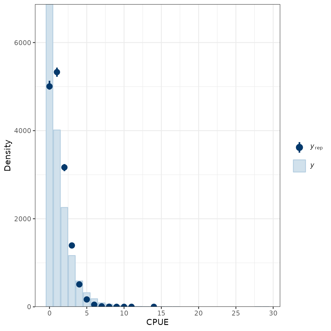
Comparison of the empirical distribution of the data (y) to the distributions of simulated/replicated data (yrep) from the posterior predictive distribution.
ppc_ecdf_overlay(y = lobsters_per_pot$lobsters, yrep = yrep, discrete = TRUE) +
  coord_cartesian(xlim = c(0, 10))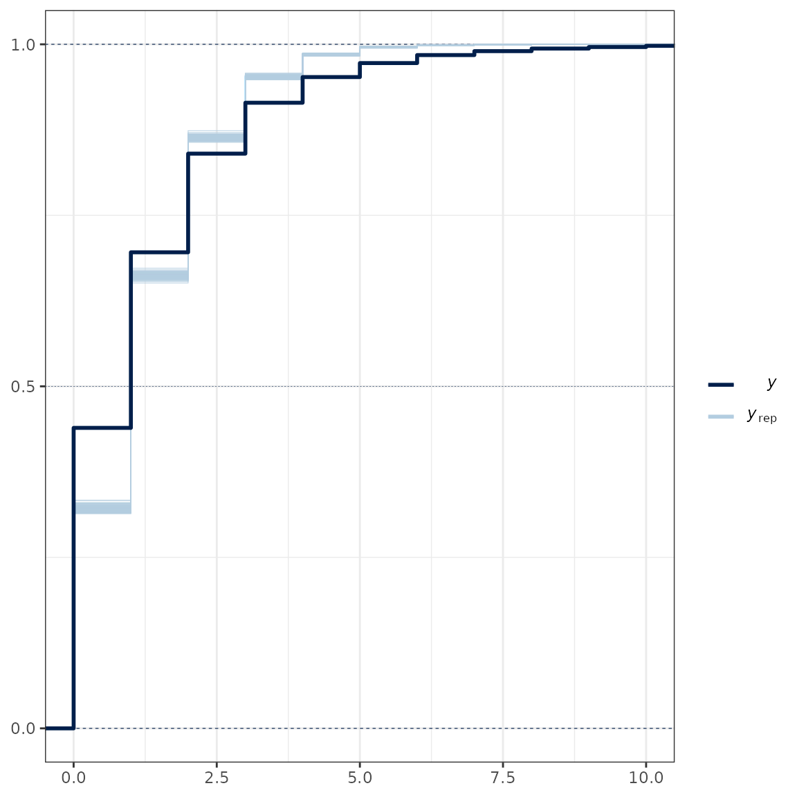
Posterior predictive check.
# loo <- loo(fit1, save_psis = TRUE)
# psis <- loo$psis_object
# lw <- weights(psis)
# yrep <- posterior_predict(fit1)
# ppc_loo_pit_qq(y = lobsters_per_pot$lobsters, yrep = yrep, lw = lw)
# plot_qq(fit = fit1)
# plot_predicted_residuals(fit = fit1, trend = "loess")
# plot_predicted_residuals(fit = fit1, trend = "lm") +
#   facet_wrap(year ~ .)
# A new style of residual plot
fit <- fit1

# Extract predicted values
pred <- fitted(fit) %>% data.frame()
names(pred) <- paste0("pred.", names(pred))

# Extract residuals
resid <- residuals(fit) %>% data.frame()
names(resid) <- paste0("resid.", names(resid))

df <- cbind(resid, pred, lobsters_per_pot)

ggplot(data = df, aes(x = year, y = .data$resid.Estimate)) +
  geom_pointrange(aes(ymin = .data$resid.Q2.5, ymax = .data$resid.Q97.5), alpha = 0.75) +
  facet_wrap(month ~ .) +
  geom_hline(yintercept = 0, linetype = "dashed") +
  # geom_errorbarh(aes(xmax = .data$pred.Q2.5, xmin = .data$pred.Q97.5, height = 0), alpha = 0.75) +
  # labs(x = "Predicted values", y = "Residuals") +
  theme(axis.text.x = element_text(angle = 45, hjust = 1))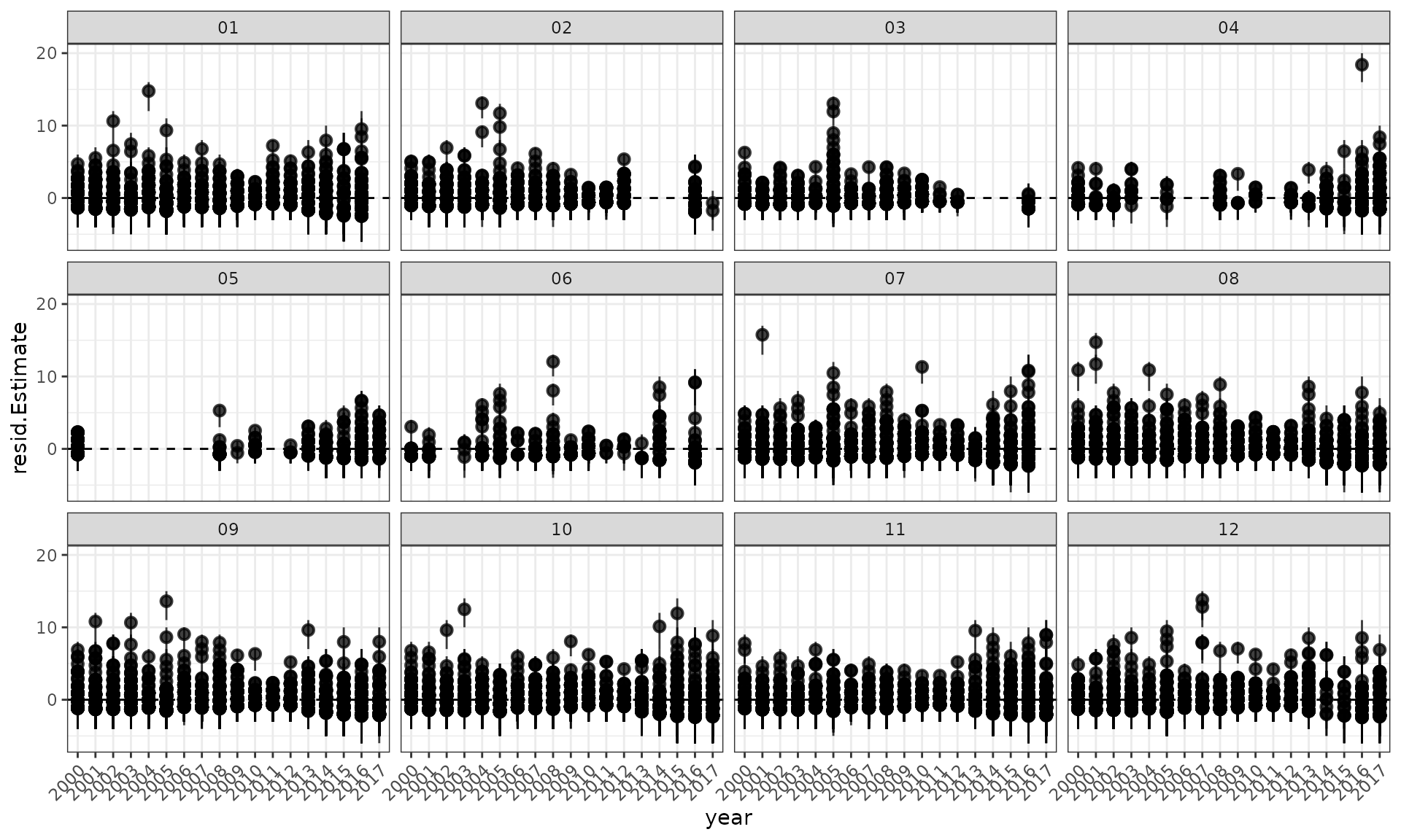
Residuals and a loess smoother by year.
Implied residuals
Implied coefficients (points) are calculated as the normalised fishing year coefficient (grey line) plus the mean of the standardised residuals in each year for each category of a variable. These values approximate the coefficients obtained when an area x year interaction term is fitted, particularly for those area x year combinations which have a substantial proportion of the records. The error bars indicate one standard error of the standardised residuals. The information at the top of each panel identifies the plotted category, provides the correlation coefficient (rho) between the category year index and the overall model index, and the number of records supporting the category.
# plot_implied_residuals(fit = fit2, data = lobsters_per_pot,
#                        year = "year", groups = "month") +
#   theme(axis.text.x = element_text(angle = 45, hjust = 1))
# plot_implied_residuals(fit = fit2, data = lobsters_per_pot,
#                        year = "year", groups = "depth") +
#   theme(axis.text.x = element_text(angle = 45, hjust = 1))
Functions for generating outputs for stock assessment
Finally, in order to fit to the data in a stock assessment model then
indices can be produced using the get_index function. The
Estimate and Est.Error columns are what should
be used in stock assessment.
unstd <- get_unstandarsied(fit = fit2, year = "year")
cpue0 <- get_index(fit = fit2, year = "year")

cpue0 %>%
  mutate(Unstandardised = unstd$Median) %>%
  select(Year, Unstandardised, Mean, SD, Qlower, Median, Qupper) %>%
kable(digits = 3)| Year | Unstandardised | Mean | SD | Qlower | Median | Qupper |
|---|---|---|---|---|---|---|
| 2000 | 0.885 | 0.915 | 0.068 | 0.786 | 0.917 | 1.053 |
| 2001 | 1.028 | 1.044 | 0.079 | 0.902 | 1.043 | 1.202 |
| 2002 | 1.021 | 1.034 | 0.078 | 0.894 | 1.034 | 1.193 |
| 2003 | 1.090 | 1.100 | 0.081 | 0.952 | 1.101 | 1.266 |
| 2004 | 0.897 | 0.890 | 0.068 | 0.765 | 0.890 | 1.029 |
| 2005 | 1.139 | 1.238 | 0.091 | 1.067 | 1.238 | 1.423 |
| 2006 | 0.834 | 0.808 | 0.063 | 0.691 | 0.809 | 0.934 |
| 2007 | 0.876 | 0.873 | 0.066 | 0.749 | 0.872 | 1.008 |
| 2008 | 0.911 | 0.939 | 0.070 | 0.814 | 0.938 | 1.087 |
| 2009 | 0.768 | 0.734 | 0.056 | 0.630 | 0.734 | 0.850 |
| 2010 | 0.606 | 0.579 | 0.045 | 0.494 | 0.578 | 0.673 |
| 2011 | 0.620 | 0.551 | 0.045 | 0.465 | 0.551 | 0.646 |
| 2012 | 0.700 | 0.653 | 0.052 | 0.560 | 0.653 | 0.761 |
| 2013 | 1.200 | 1.189 | 0.095 | 1.017 | 1.188 | 1.388 |
| 2014 | 1.373 | 1.428 | 0.107 | 1.238 | 1.427 | 1.651 |
| 2015 | 1.666 | 1.652 | 0.130 | 1.416 | 1.655 | 1.923 |
| 2016 | 1.620 | 1.750 | 0.127 | 1.519 | 1.749 | 2.014 |
| 2017 | 1.615 | 1.683 | 0.132 | 1.438 | 1.684 | 1.954 |
ggplot(data = cpue0, aes(x = Year)) +
  geom_pointrange(aes(y = Median, ymin = Qlower, ymax = Qupper)) +
  geom_line(aes(y = Mean, group = 1), colour = "red") +
  scale_y_continuous(limits = c(0, NA), expand = expansion(mult = c(0, 0.05))) +
  labs(x = NULL, y = "CPUE") +
  theme(axis.text.x = element_text(angle = 45, hjust = 1))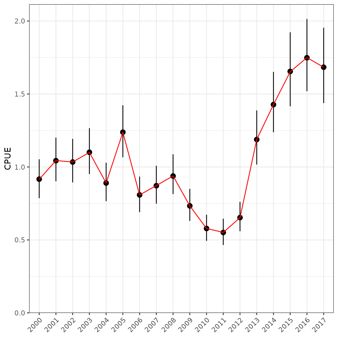
cpue1 <- cpue0 %>% mutate(Type = "Estimate")
cpue2 <- cpue1 %>% mutate(Type = "Simulated wrong")
cpue3 <- cpue1 %>% mutate(Type = "Simulated")

for (ii in 1:nrow(cpue1)) {
  sdd <- cpue1$SD[ii] # this is wrong
  r1 <- rlnorm(n = 5000, log(cpue1$Mean[ii]), sdd)
  cpue2$Median[ii] <- median(r1)
  cpue2$Qlower[ii] <- quantile(r1, probs = 0.025)
  cpue2$Qupper[ii] <- quantile(r1, probs = 0.975)

  sdd <- log(1 + cpue1$SD[ii] / cpue1$Mean[ii])
  r1 <- rlnorm(n = 5000, log(cpue1$Median[ii]), sdd)
  cpue3$Median[ii] <- median(r1)
  cpue3$Qlower[ii] <- quantile(r1, probs = 0.025)
  cpue3$Qupper[ii] <- quantile(r1, probs = 0.975)
}

df <- bind_rows(cpue1, cpue2, cpue3)

ggplot(data = df, aes(x = Year, y = Median, colour = Type)) +
  geom_pointrange(aes(ymin = Qlower, ymax = Qupper),
                  position = position_dodge(width = 0.5)) +
  scale_y_continuous(limits = c(0, NA), expand = expansion(mult = c(0, 0.05))) +
  labs(x = NULL, y = "CPUE") +
  theme(axis.text.x = element_text(angle = 45, hjust = 1))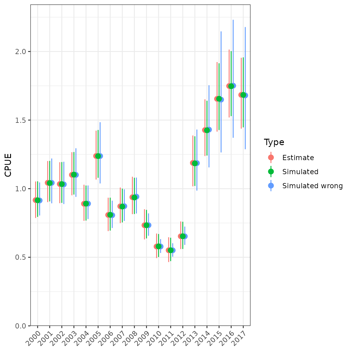
Simulating from a lognormal distribution and comparing with table values. Simulating with the wrong SD underestimates the uncertainty at low values.